Logos are the centerpiece of your brand identity. Looking out over the vast and varied landscape of logos, it seems almost impossible to navigate the endless options out there toward the one that will express your company best. This is why many people don’t think twice about going to a branding agency in Orange County to assist them with logo development. For this blog, we’ll zoom out a bit and look at the basic makeup of some of the most common approaches to logo design.
Wordmark
As you can imagine, the wordmark focuses the viewer’s attention on one thing: the name. As such, a wordmark logo has become a staple for brands who want to let their name do the talking. In this sense, relying solely on the lettering of your name has an ability to convey simplicity, confidence, even timelessness, as visuals go out of style far quicker than fonts do.
Lettermark
Lettermark simplifies a brand’s name down to the initial letters. There are two good reasons organizations choose to implement a lettermark logo. It’s the go-to for organizations who have a long or complicated name (think National Aeronautics & Space Administration–NASA). Second, going with a lettermark logo invariably adds power, impact, and possibly even appeal to your brand’s first impression. Seeing as your logo will be looked at for just seconds before people start forming opinions about your company, impact matters.
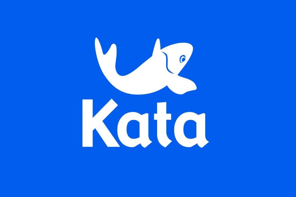
Brandmark
Going even further down the road of logo simplification, we arrive at brandmark, which foregoes text, relying on the recognizability of an image to carry the brand’s message. The app world is awash in this strategy for the obvious reason that you can only fit so much onto a segment of a mobile screen.
Brandmarks aren’t just for apps, though. It’s argued that the brain responds more instinctually to images than written text, reacting almost immediately. This principle, however, is a double-edged sword. If you’re reducing your message to just an image, those who have yet to form an impression about your brand may be unlikely to dig deeper to find out about you—intrigue only goes so far. That’s why when you think of the most common brands that utilize brandmark—Target, Apple, Nike—they’re some of the most recognized brands in the world.
Mix it up
Just as commonly, brands will rely on a mixture of text, lettering, and images, thus taking advantage of the benefits of each for their logo development. Be aware that the more going on in a logo, the harder it is to resize. For this very reason, brands may choose to implement more than one style of logo, depending on the medium it appears in. There’s nothing to say your visual identity can’t include a wordmark and a brandmark logo. This way there is a standardized logo for general purposes, as well as a brandmark for instances where the logo can stand alone without text. This way, you’ll have more to strategize with.
This hits at a main point in logo development: your logo, as well as overall visual identity, needs to be firmly based in strategy, meaning it reflects the vision, mission, and core values of your business. If you’re using a branding agency in Orange County, or anywhere, before they’ll be able to craft a logo that expresses you, they’ll need to be able to understand your brand’s strategy, and who you are.
If you’d like to have something on which to draft your design preferences to branding professionals, you can do so with Adobe’s free logo design templates.