What are you expressing with your logo’s shape? The answer is: something! Even if you haven’t put thought into the shapes of your brand’s logo, it’s likely that your customers have on a conscious or subconscious level.
What’s the difference between a circle and a square? How does a zig-zag make you feel, compared to a wavy line? Whether you realize it or not, your mind tunes into shapes in a highly-sophisticated way—it actually approaches the sophistication of language, and may hearken back to the very first humans who decided to communicate an idea by drawing a shape. Company logo design is one of the first and most powerful ways that you communicate to your audience, and our efforts of branding in Orange County naturally focus heavily on the logo and what its shapes express.
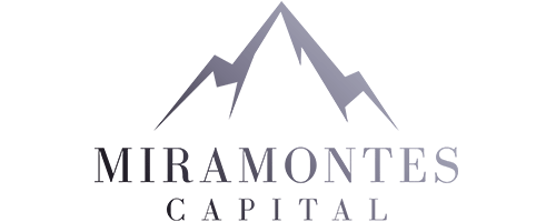
Take a look at the logo we designed for Miramontes Capital. Everything, from the sharp, jagged mountain peak to the stark, rigid letters of the font (which is always an integral extension of logo and brand identity) expresses strength, confidence, and linear thinking. This harmonizes at once with the confidence that clients in the financial sector demand when looking for an adviser. Compare that with the loose and fluid design of the work we did for Hawaii Lassi. It’s in stark contrast to the rigid, mountainous terrains of Miramontes. Here, a flowing leaf is the backdrop for the company’s name, which is rendered in a font that accentuates curves over angles. This gives the Feminine the spotlight over the Masculine. The artwork for the brand, too, follows in this line, with the fruit of each drink rendered in a soft, sketched pastel style which avoid hard lines. It expresses the relaxed, flowing lifestyle that the Hawaiian drink embodies.
Imagine you’re a handbag maker. It would be incredibly unlikely for someone to render a successful logo without seeing the handbags, and hearing the story and ideals of the company beforehand. This goes for every company and logo. Is your service and your company more masculine or feminine? This isn’t a sexist question, and shouldn’t be considered as such. A dress maker’s image can be more solid and masculine. It’s possible that a motorcycle company can thrive with a logo design and identity that is fluid, and more feminine. Many logos are a solid and balanced marriage between masculine and feminine shapes and cues. What matters is that you are tuned into the identity that has naturally developed over time for your company.
Looking for branding in Orange County? Be sure to take into account how important your logo design is and what message its shapes are expressing. Whether the message is designed to hit you in the face, or make a subtle suggestion, make sure that it relates to who your company is. If so, your customers will have no trouble hearing the message.