When explaining to someone what Twelve12 does, more often than not I find myself focusing my explanation on branding, saying things like, “It’s not just logo! It’s not just logo!” Everybody knows what a logo is, and usually it’s much harder for them to grasp the difference between this and the more abstract concept of branding.
However, knowing what a logo is and knowing what your company’s logo should be are two totally different things. The logo is crucial, which is why I wanted to dedicate a little time to thinking about what makes a good logo.
There’s a lot of good branding in Orange County, which means you see a lot of catchy-looking, even well-designed logos out there. Your logo is the most concise way to explain your company—it’s even shorter than the elevator pitch. It has to be laser-accurate so as not to be a hindrance to your customer understanding what your company is about.
So what does a good logo do?
It creates curiosity
The logo introduces your company, but it can’t adequately explain everything about your business. That’s why the best logos contain an element of curiosity in them—something to draw the customers in to a position where they want to learn more.
This is obviously not the same as confusing the viewer—which a logo must never do. It must be instantly “gettable,” but with an air of interest to it.
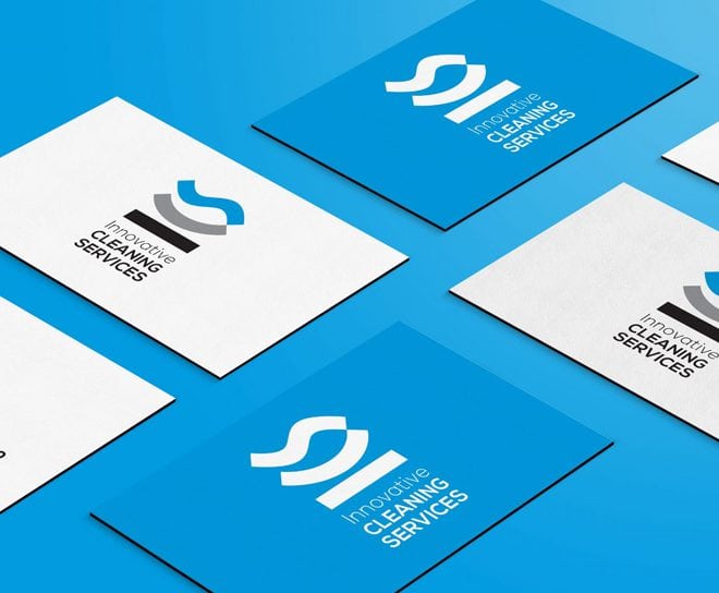
Take a look at our logo for innovative Cleaning Services, a logo made of three apparently abstract elements. But, when you turn the business card on its side you notice that the shapes are actually just the initials of the company—ICS. Even more than that, the logo tells the story of the company. The solid black “I” represents the foundation of the company. Moving up, the softer “C” forms a cradle, from which the “S” of service—always at the top—emerges. This bottom-up integration is exemplified everywhere in the company, which does everything possible to put its employees first. As a logo, it tells a story. It draws you in, but rewards you for looking at it long enough to get the message.
It communicates what you do—and how you do it.
Logos must also avoid being an arbitrary curious image. It’s got to have weight, and meaning, and it must familiarize the viewer with who you are on the level of an impression. You may be a tailor who does excellent work almost exclusively with high-end contemporary suits with slim cuts. If your logo doesn’t immediately say “slim, high-end, modern,” but rather just has clip-art images of a scissors and tape measure, you’re making your clientele do the footwork to find out who you are.
This is where a lot of branding in Orange County falls short—the logo doesn’t come from the heart and values of the company, but rather is a mere expression of the sleek style of the times. Digging deeper means understanding your brand first & foremost, then and only then, will you be able to express it visually.